On the Complexities of Numerical Modeling
December 14, 2016I have the great fortune of frequently chatting with my friend, Kyle, about technical and coding problems. We're constantly in a state of no-judgment brainstorming, which leads to a lot of excellent discussions. Kyle is in web-development and maintains a decade-plus love affair with solving problems with code; a field in which he is much my superior. However, during one of our discussions, it came to light that even though he has decades of experience with code, he has very little experience with numerical modeling or statistical analysis. This actually seems to be fairly standard amongst even the most technically minded of people; they know how to build programs but not how to analyze large sets of statistical data. That brought an idea to the forefront of my mind: can I explain the essence of numerical modeling without digging to deeply into code specifics?
Let's start with an example from physics. Let's say we have data from a bunch of different particles, the names and types of the particles don't matter. In this example, the data from these particles is mixed together. All we know is that there are 3 different types of particles and thousands of each type are mixed into our data, with each particle being indistinguishable from the others without analysis. What we have is a giant "data soup" where there are tons of particle X, but we have no way of knowing definitively which data points come from particle X instead of particle Y or particle Z.
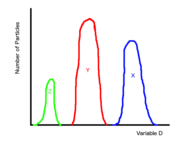
Now let's say that we have a certain type of data recorded for each particle which we'll call the "Discriminator value" (D-value) because it has the power to help us know which type of particle we are looking at. For instance, if we see that the D value for a certain particle data point is 1, we know that it's particle X. So there's some range of variable D that we know corresponds to particle X. We can have the same thing for particles Y and Z. In a roughly sketched graph, that could look like this.
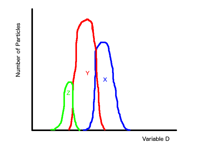
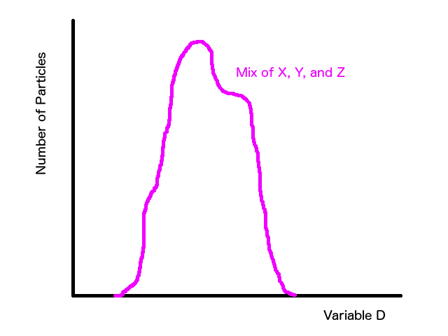
The first thing to do is to ask, "do I know anything about the data that can help me decide how I want to model this?" In this example, we know that there are three different types of particles, which is a great start. It tells us how many different types of models we need to combine to get our global model. At this point, it becomes a bit of an art form where experience helps teach what brush to use when designing your models. It's also good to note that Occam's Razor goes a LOOOOONNNGGG (emphasis required) way when modeling. Always start simple and then add complexity or you can quickly get stuck with a model that's so complicated you can't control how it's working. In this case, I would look at the magenta distribution and say, "hey, I see two vague peaks and a little bit of a rounded kick out on the left side. I also know I should have three distributions, so maybe I have three distributions that are loosely peaked and flare out on the sides." This naturally leads me to start with three simple bell-curves (Gaussian distributions).
Now here, we must take a bit of a technical aside to describe how the models actually work. In it's simplest form, the equation for a Gaussian looks like this:

In this equation A, B, and C are all variables that tell us about the Gaussian shape, and x is the value along the x (or horizontal) axis. A tells us the maximum height, such that in our example A is the biggest for particle Y and smallest for particle Z. B tells us where the peak is centered, because at that point the value of the exponential part of the equation has x-B = 0, so the exponential = 1. C is less easy to quickly understand and visualize, but it tells us how fat the Gaussian is going to be (a bigger C means a wider peak). When we try to make a numerical model, we define a function that we think can have the right shape. Then we use an iterative approach where we wiggle the values of A, B, and C for each peak and then calculate if the value of our function at each point along the x axis is the same as the data. If it's not, we figure out what way to change the value of the As, Bs, and Cs in order to get closer to the data. We repeat this over and over, thousands of times until we either find that we're so close to the data that changing the variables isn't helping, or we decide "this model just isn't correct enough to actually describe the data."
So in this example, I'd write a function that is the sum of three Gaussians and then wiggle the three variables for all three of them and try to find some combination of them that describes the data. The answer is what I showed initially, as you can see that there is a certain Gaussian for particle X that describes its peak range and, when combined with the peak for particle Y, the range between particle X and Y. The same for Y and Z. The technical details for how to do the wiggling and how to decide whether you have a model that describes the data are better left to another time. You can read about them around the internet; I recommend looking into Chi Square Testing and minimization/optimization.
So what does this look like when it's not hand-drawn by a three year old? I actually used this example of overlapping Gaussians because it's something I'm working on in the physics world. I'm trying to find out how to tell whether a particle is an electron. To do so, I have to disentangle it from three other types of particles. You can see a plot of it below.
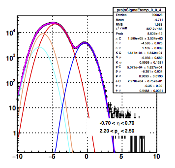
I also want to quickly point out a few of the more common complexities that I've completely skipped over in favor of readability:
- In the real life example, there's nothing special about the ordering. Blue could switch with red since they're both the same function. However, in this case I'm doing many different model fits for different slices of data, so I need to make sure blue is always the one around 0. This means you have to adds things like, "the B variable for blue must always be greater than B for red." These are known as constraints and in order to make fits reproducible, you must use them wisely. Again, this is a bit of an art form.
- The quality of the fit is often going to be dependent on what values you set the A, B, and C variables to at the start. When you're doing modeling, you never want to wiggle a variable in large steps. So if I do something stupid and say, "for the blue curve, I want to start the peak center at 1,000,000" it will never find a good fit, because it would take forever to wiggle its way back to 0. Setting starting parameter values is critical and often requires knowledge about the data.
- Choosing a model (e.g. three Gaussians) can be extraordinarily complex. I've shown a simple example where there are three distributions with three parameters each. However, it's not uncommon to need dozens or even hundreds of parameters and dozens of distributions.
- Statistics matter! I've shown a "live example" where we have lots of statistics so you can really see the shape of the overall distribution. However, if instead of almost 1,000,000 particles we only had 10, we'd never be able to do the fit.
- Correlations are a blessing and a curse. In the live example I've shown, I originally had a terrible time trying to distinguish the red, cyan, and orange curves. They way that I overcame this was to use other slices of data where it's easier to distinguish them, then extrapolate to this slice of data and add constraints. So, I used a fitting model to constraint my fitting model. This is much more complicated than what I've shown, but it's the type of work that must often be done to make an accurate model. Taking advantage of correlations can add hours, days, or even weeks worth of work, but it also often pays off with a better model.